


No items found.
Sector
Financial
Service
Rent + Rotate
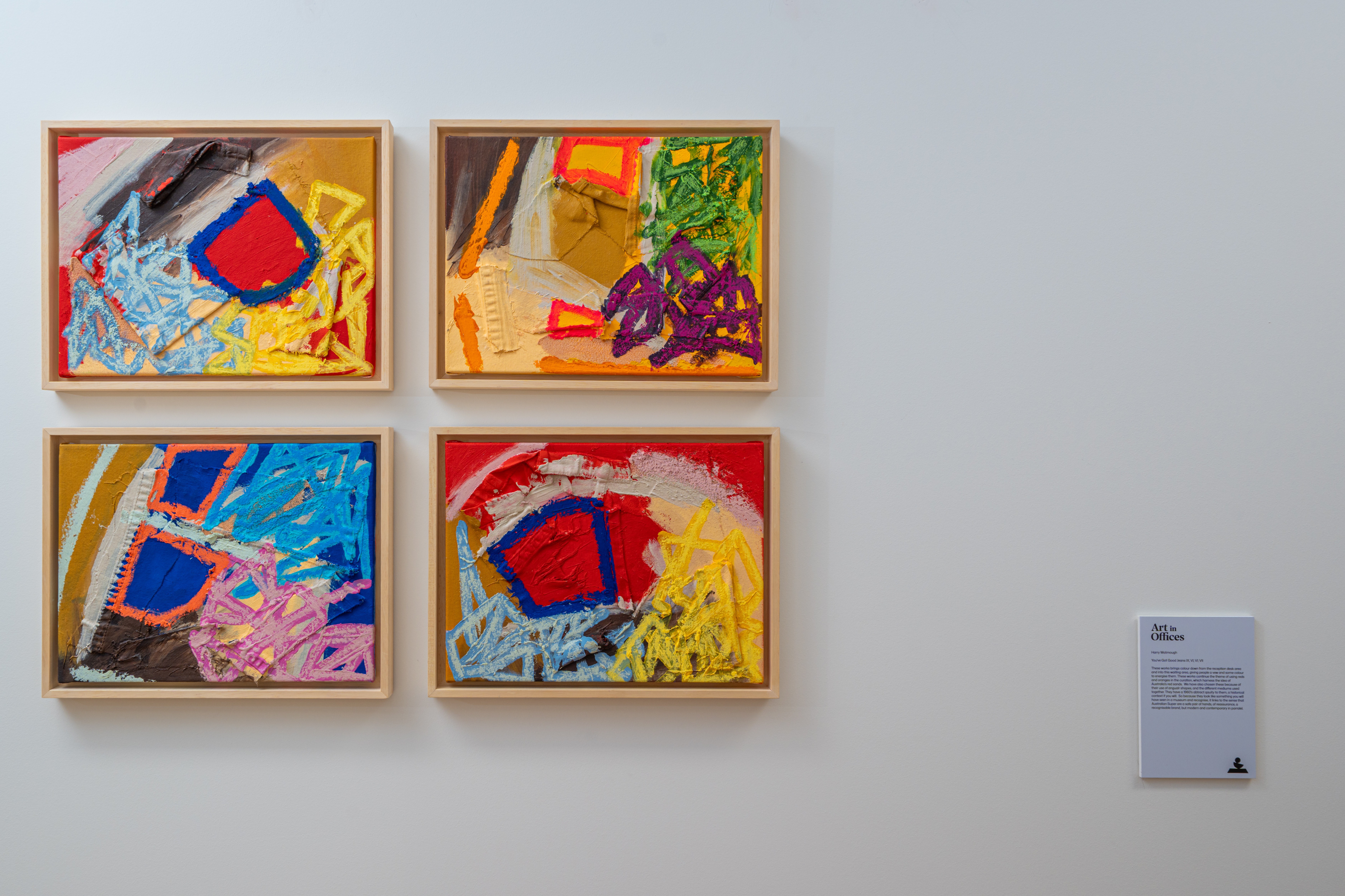
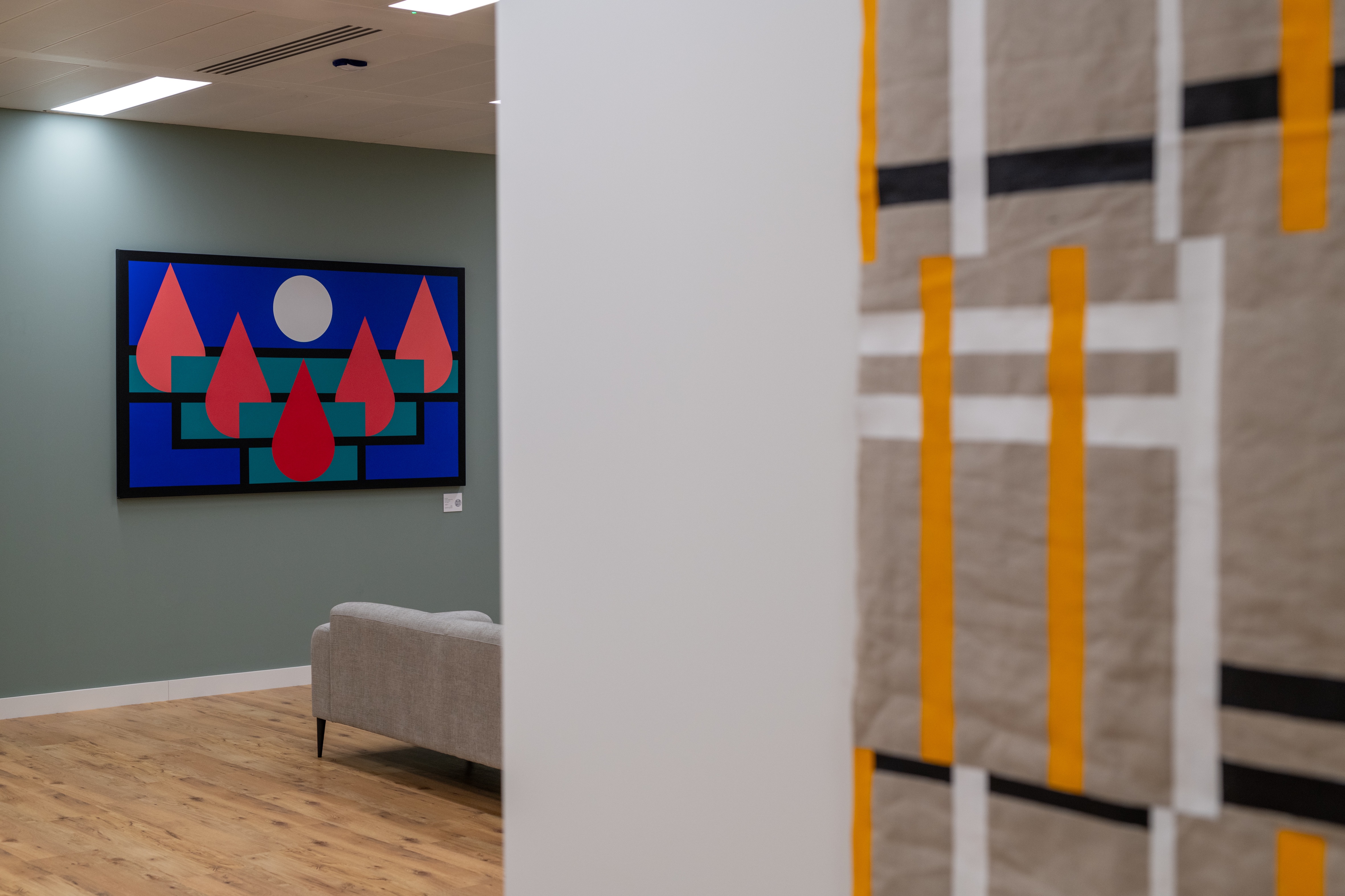
Drawing Australian inspiration
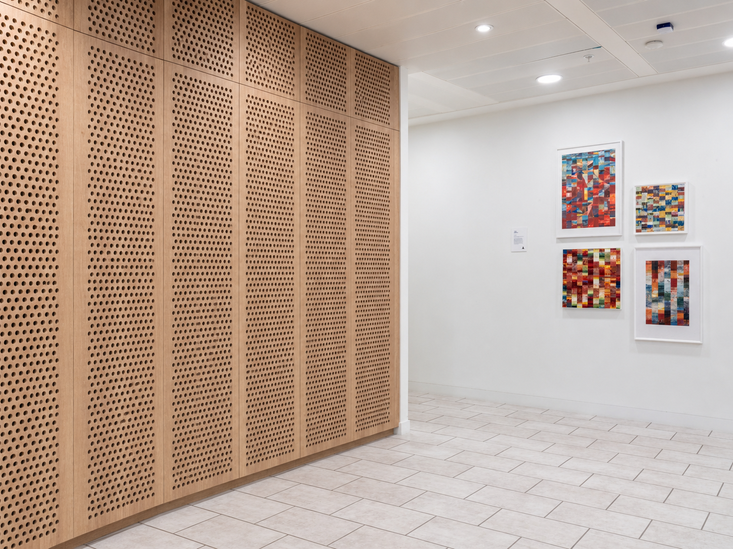
Our curation drew inspiration from the distinctive features of Australia’s landscape, incorporating earthy tones like greens and oranges, as well as the deep red associated with Uluru—a prominent natural landmark and national monument. Authentic finishes complement organic shapes and emphasise the infusion of natural light. Graphics featuring the native Eucalyptus tree enhance the connection to Australia's natural environment.
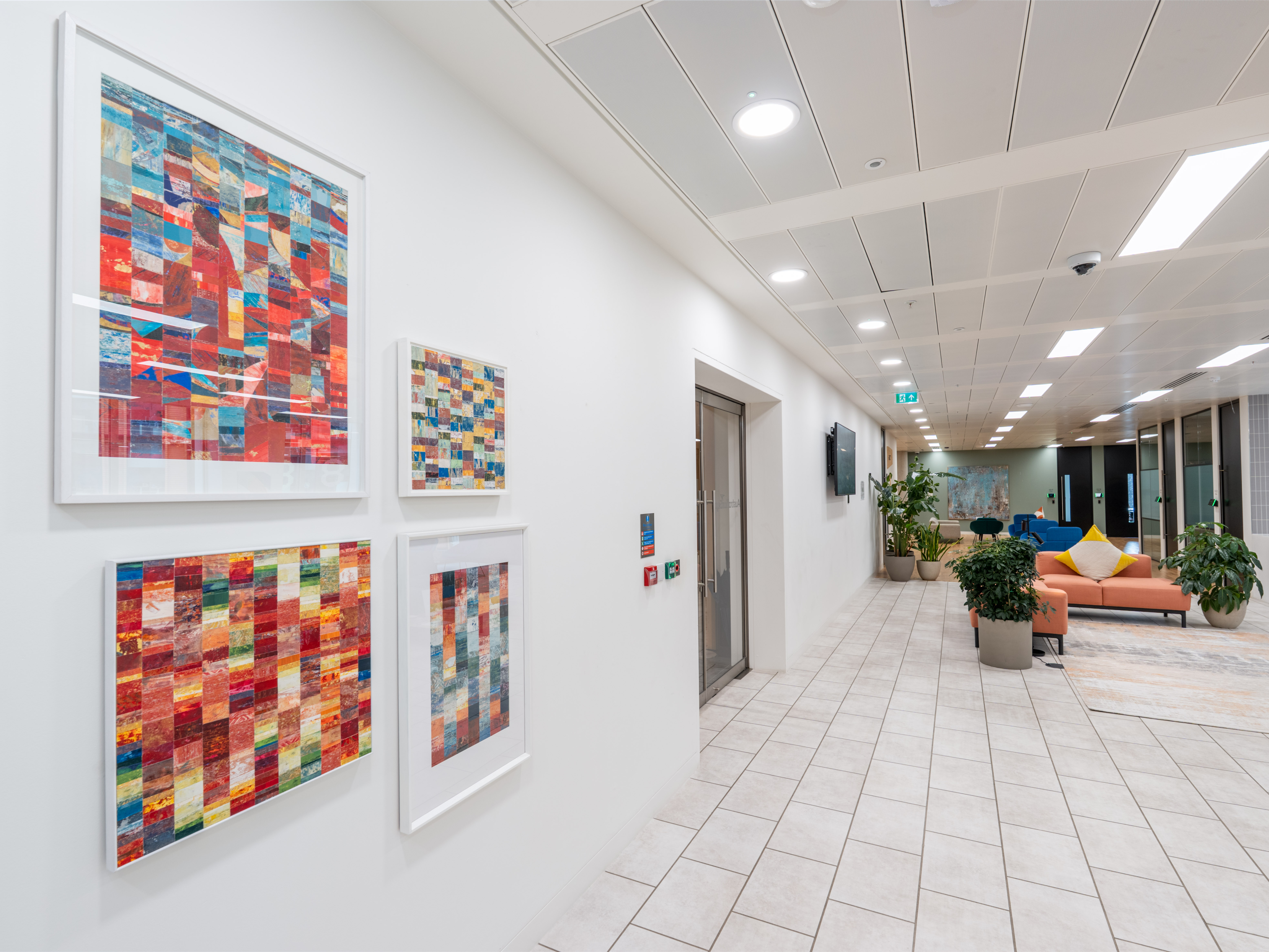
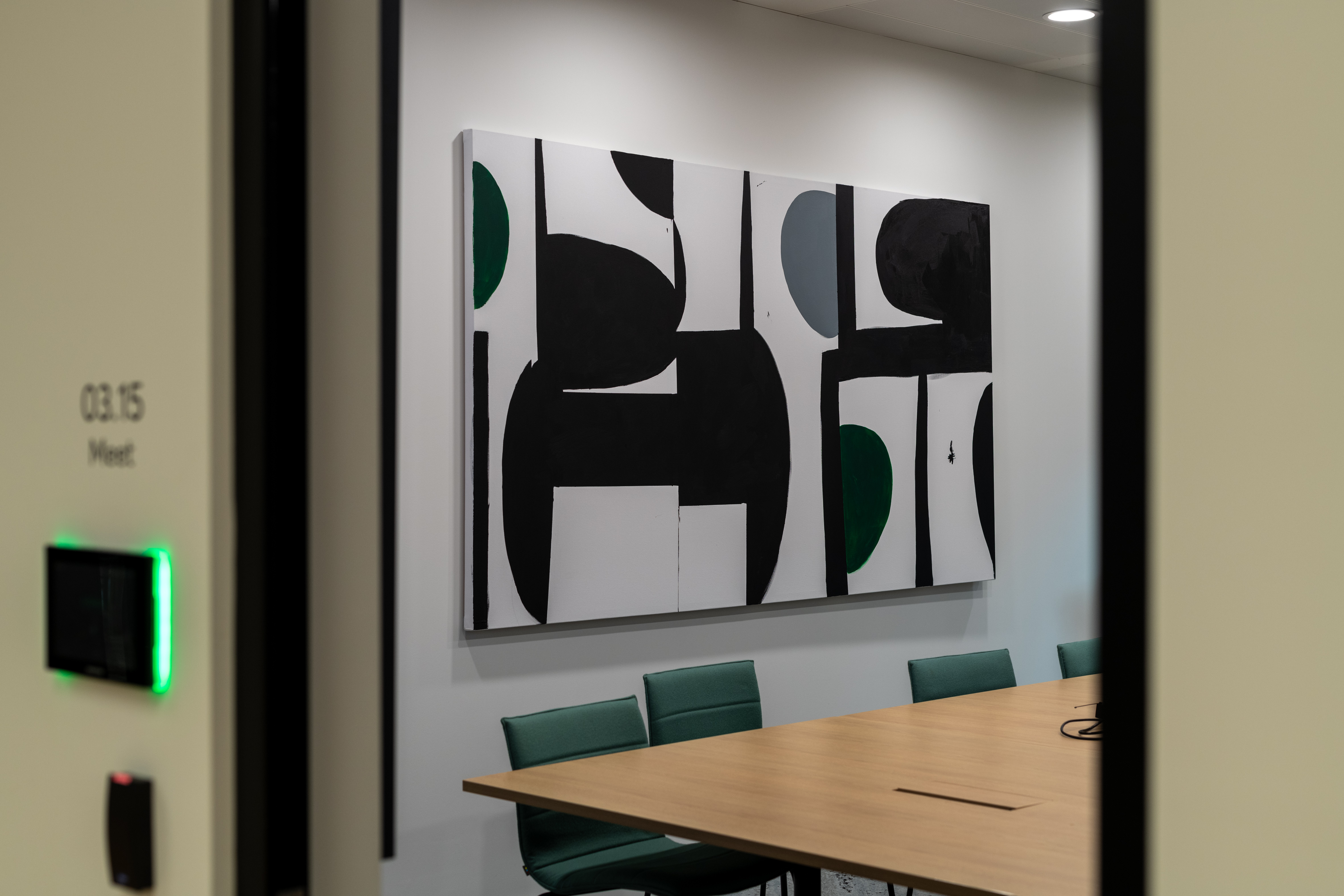
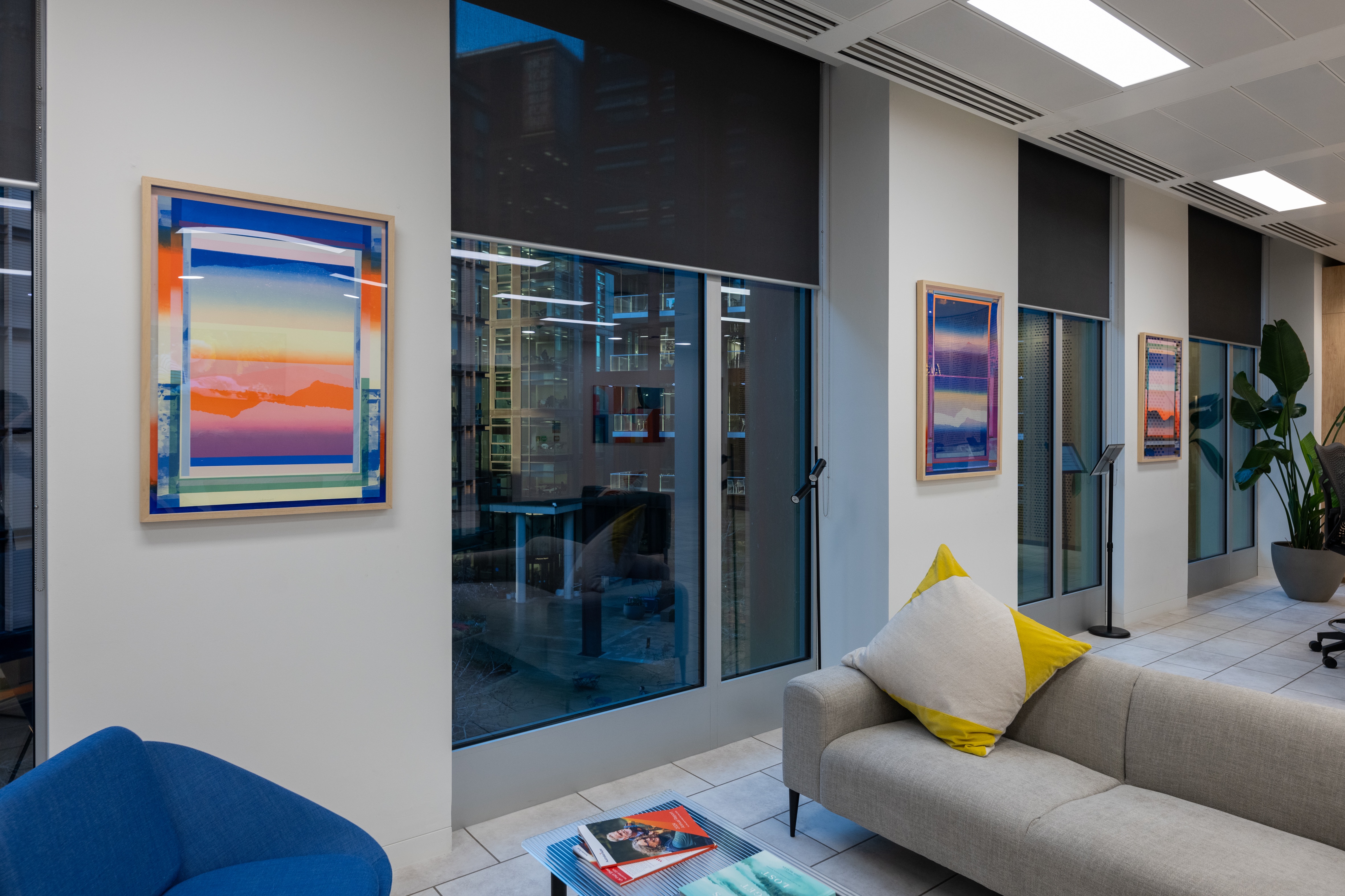
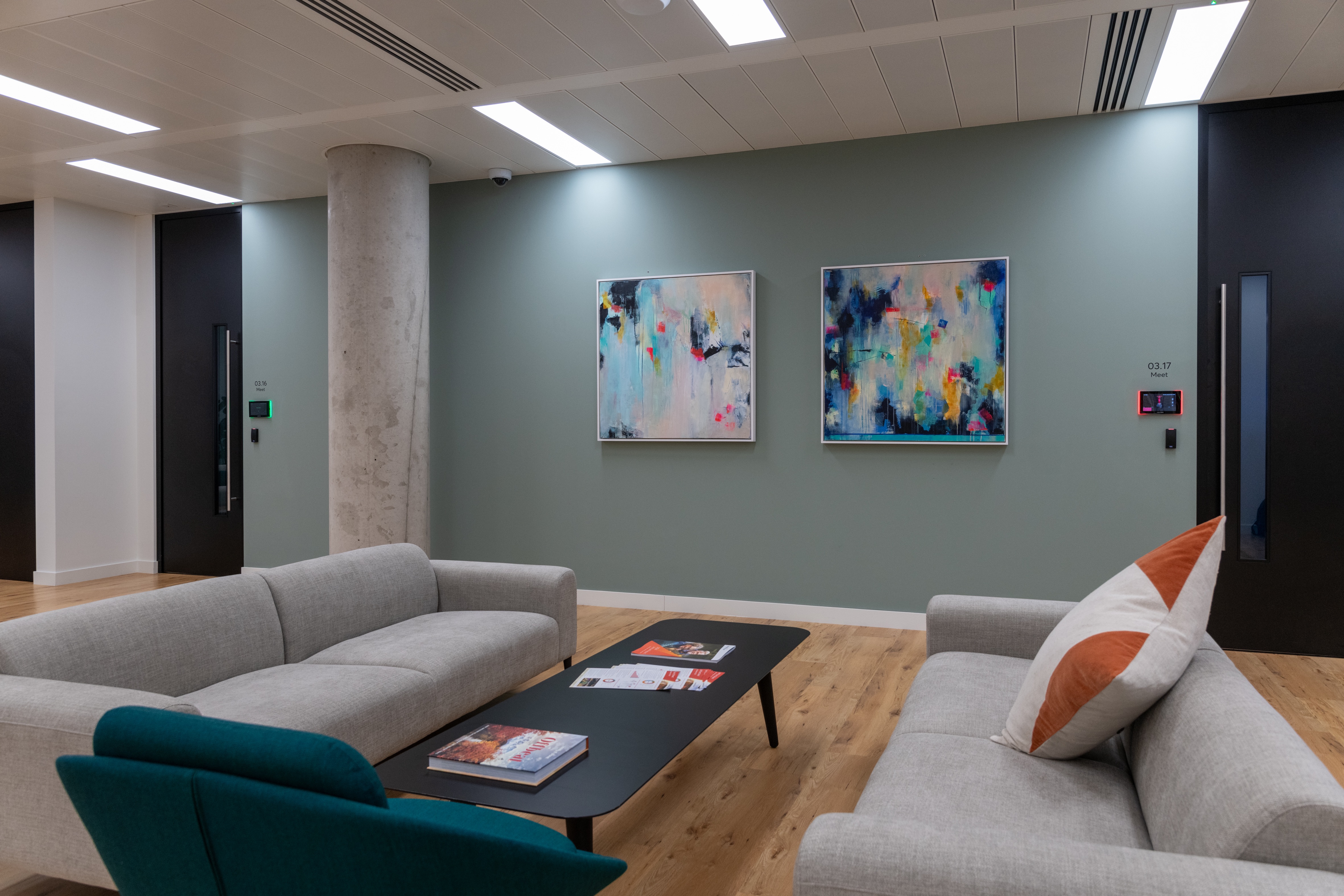
Bold shapes for modern spaces
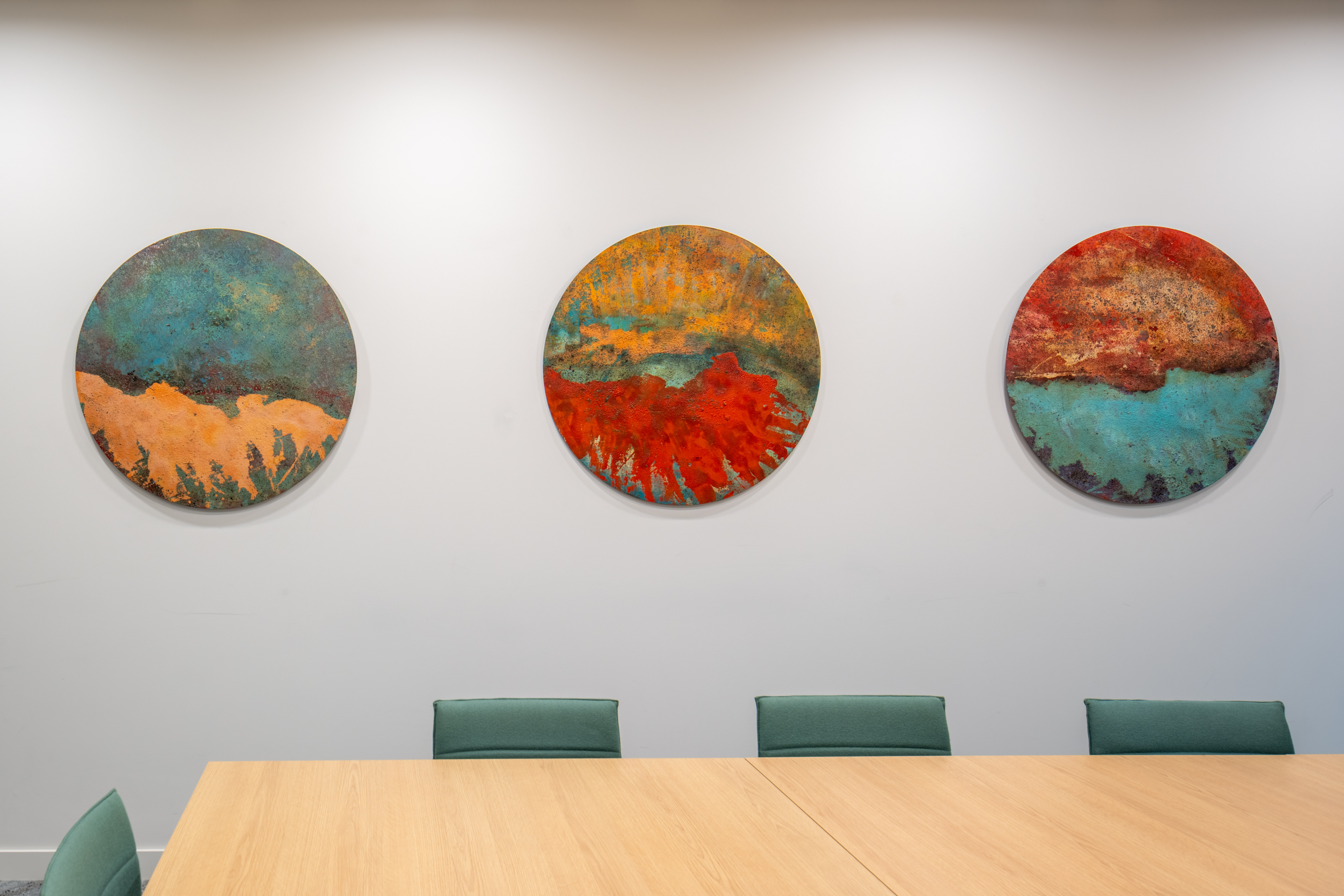
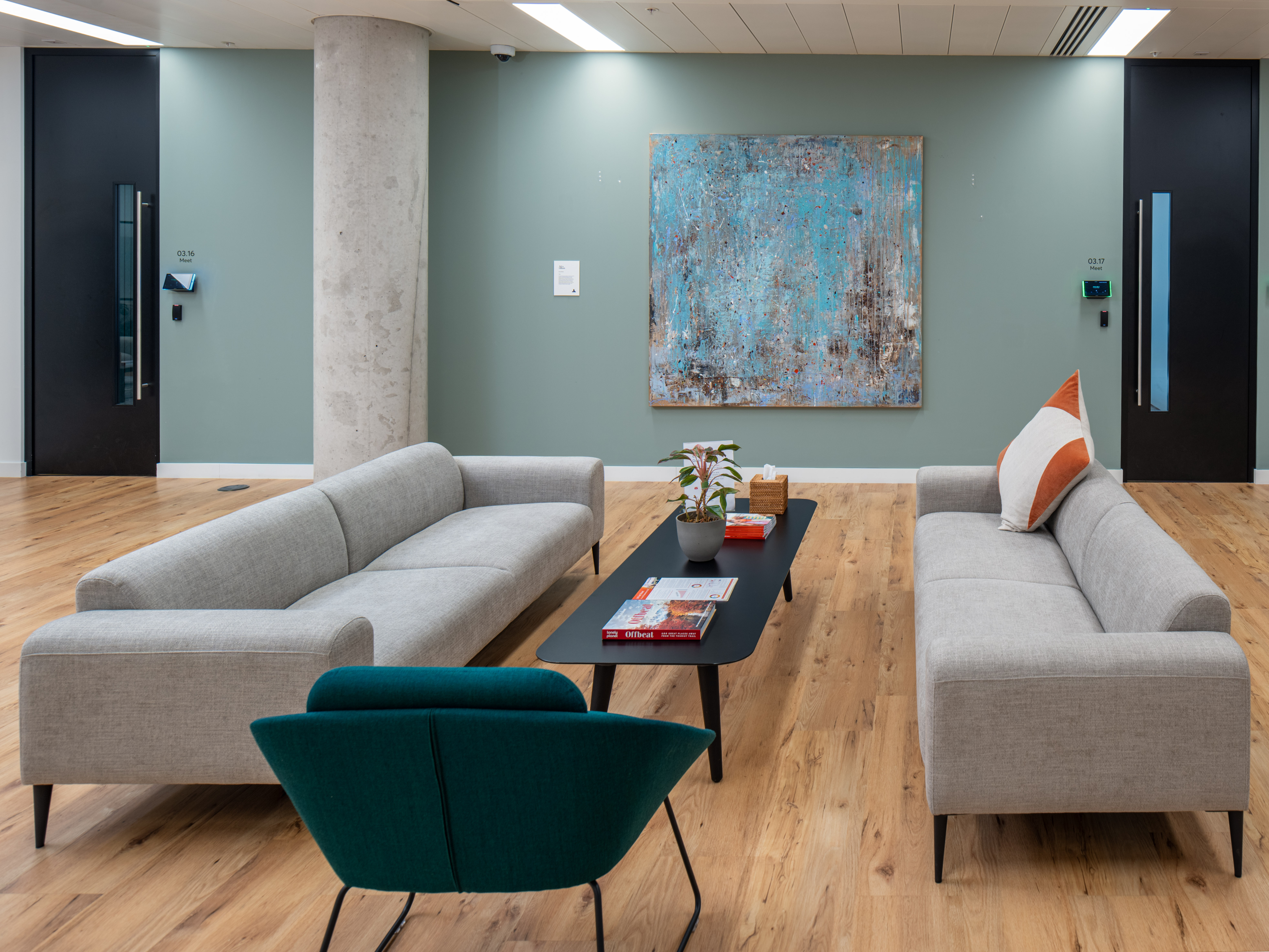
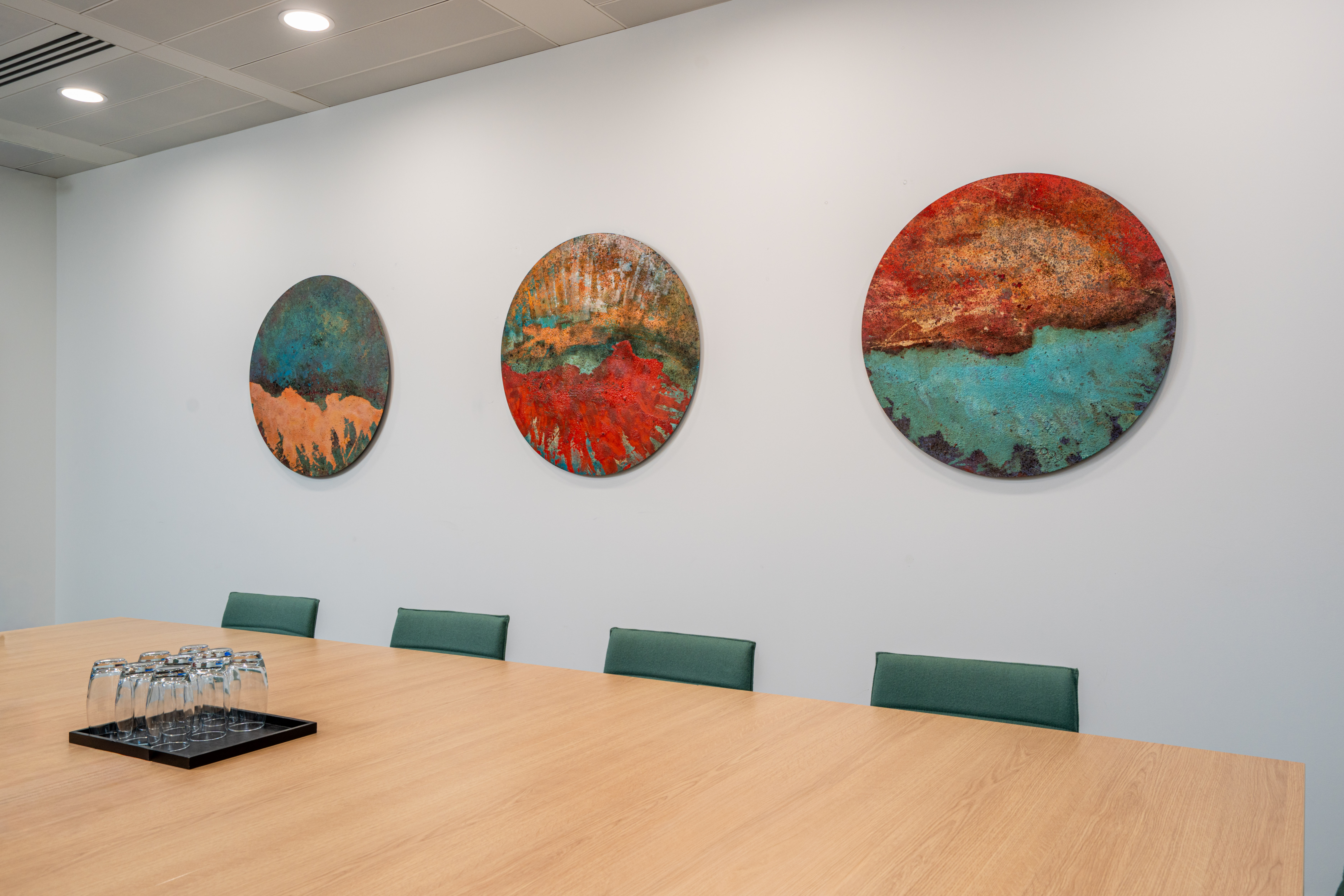
We used strong and defined shapes to connect the natural colours with the modern, contemporary aesthetic, of the office and the surroundings of urban neighbourhood of Kings Cross. As one moves through the space, you’ll arrive upon this large-scale composition which uses colour to connect strongly to Australian waterways, surf and sea, evokes a sense of the vast coastline. Turning into the meeting room, these three artworks then create the illusion of first windows or portholes, a connection to Australia’s blend of travellers and forward looking, curious spirit. With a change in perspective their compositions provide a birds-eye view of oceans and land meeting, mixing and coming together.

Tim Harper
–
Manager, Commercial & Corporate Legal, UK