

11 Lessons we've Learnt over the past 11 years
11 Lessons we've Learnt over the past 11 years
Over the last 11 years we have worked with over 100 clients of all shapes and sizes and from our experiences with them, we learned some lessons about office design which we are going to pass on to you. Some of our clients breezed through the process and have been living happ;liy ever after with art in their office, and some are still living with empty white walls. We don’t want that to be you, so. We’re going to pass on the top tips to make sure your project goes like a breeze.
1.Think about the art BEFORE you renovate or move.
It sounds like an obvious one doesn’t it, but so many of our clients have got to the end of the office move, the furniture is in, the moss walls are up and then they say “oh, there’s a lot of white empty wall isn’t there.” Thinking about the art beforehand means you’ll be able to budget for it, choose pieces that are in keeping with any new design and new furniture, and make it part of the whole project so that it’s a finished project as soon as the staff move in.
2. Match the artwork to your brand and company personality.
Are you a family solicitor? You’ll want something modern but cozy and family feeling. Are you a startup – You’ll need something that says “we’re young and hip and on trend!” Are you a Fintech? - You’ll want something with metal and neon and bright colours that says “we are futuristic and Avant Guard!” you get the jist.
3. Always start with the question, “What do I want my clients and staff to think when they walk through the door?”
The answer to this question will help you choose the right art and the right design for your office. Put yourself in the shoes of your client and imagine them getting out of the lift and seeing your reception for the first time. What should they see? What should they feel?
4. The Client facing areas CAN HAVE different art to the back office.
Sure, you need to give off a certain impression to your clients, and if you’ve got a meeting room suite that is client facing, this should be where you really focus on your brand identity. But if there’s a back office where the clients never go, feel free to be fun! Think of the staff and what they’ll want to see.
5. Don’t forget the corridors.
People walk down them, a lot! They should not be forgotten as spaces because they are transient and get a lot of footfall, so these spaces count just as much.
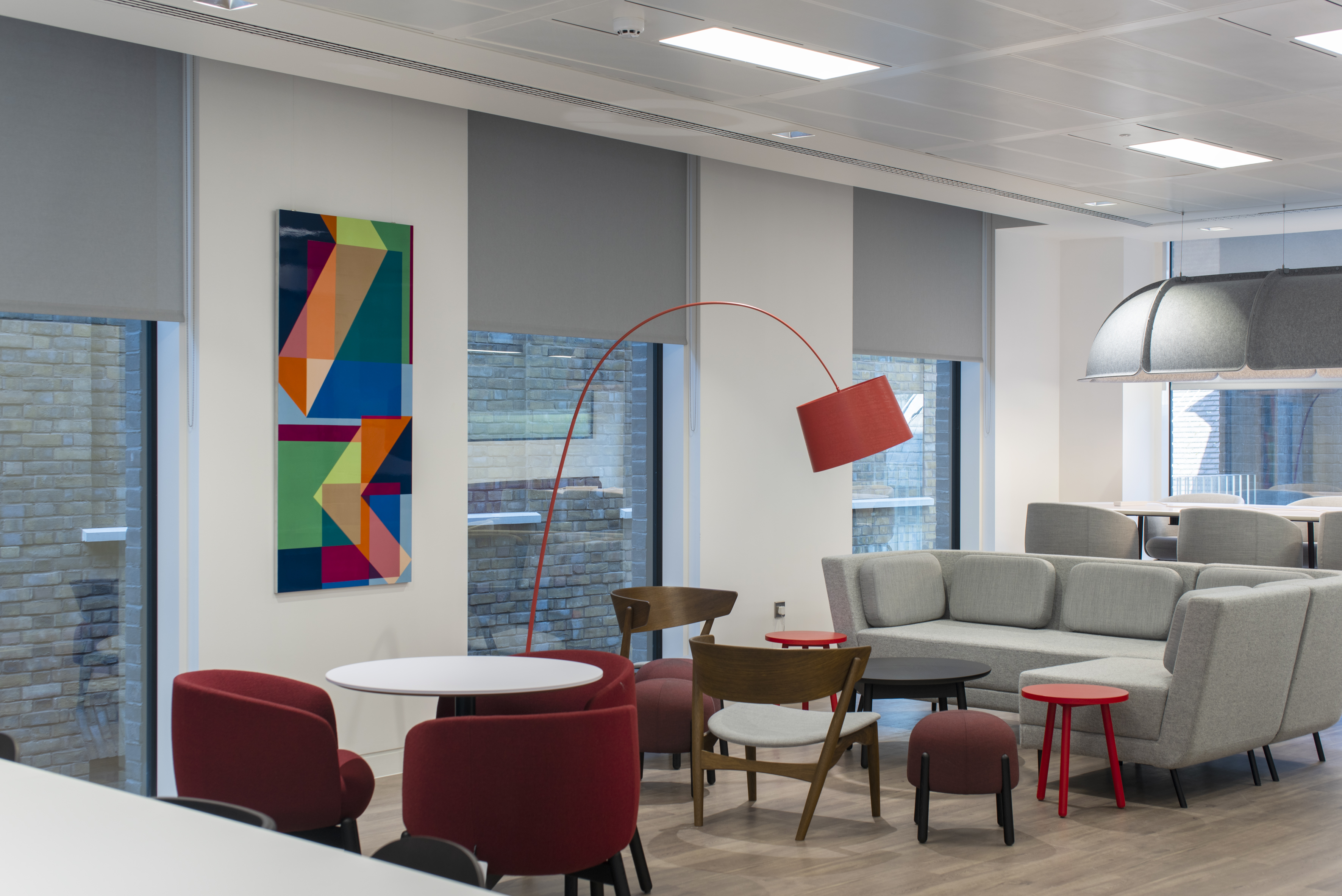
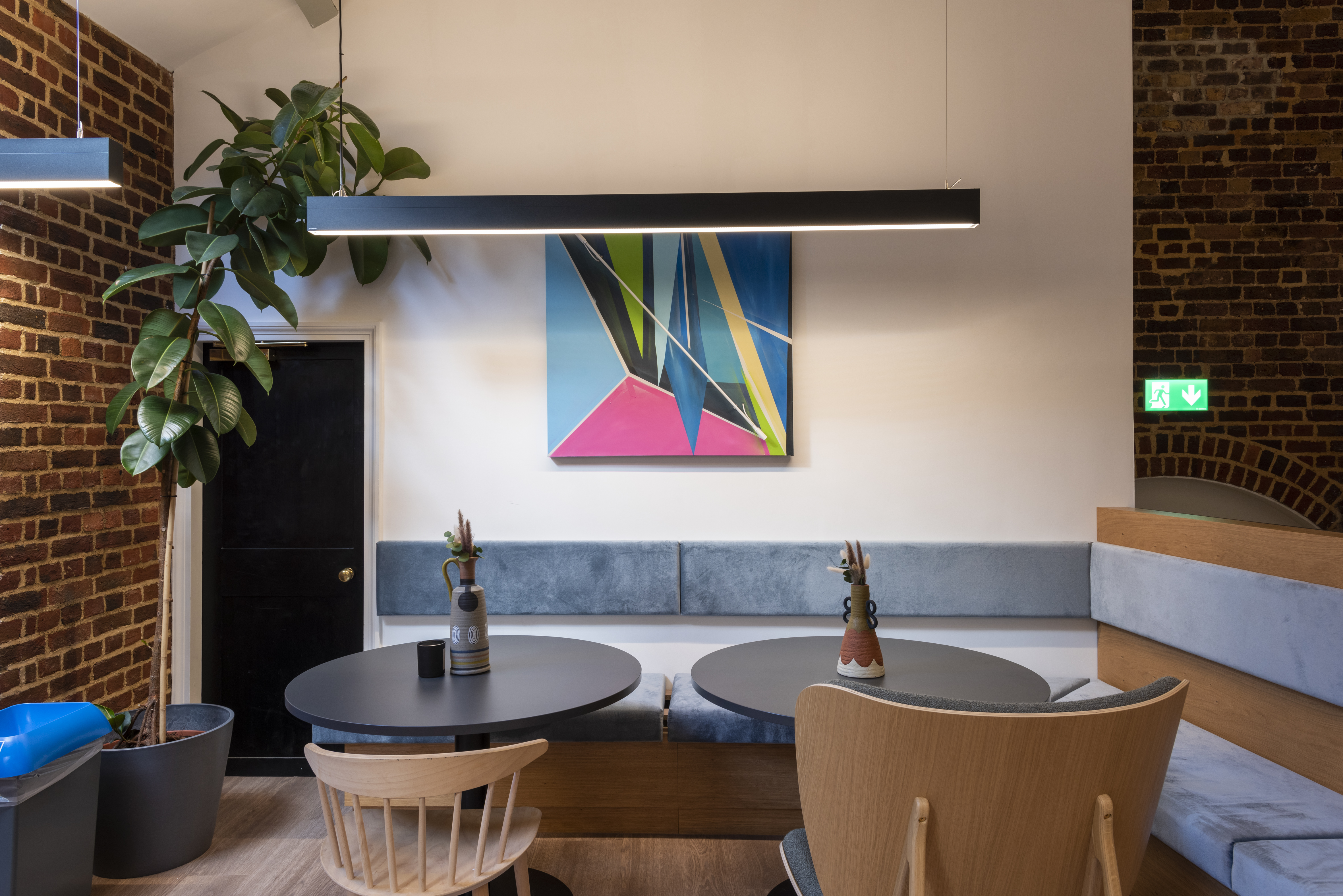
6. Create impact!
Put the high impact pieces in reception and in the meeting rooms. If you’ve got a meeting room no one wants to use, put a really colourful and quirky piece in there and see the difference it makes. Put something with wow factor in reception for that amazing first impression.
7. Don’t use IKEA art.
IKEA art may be cheap and easy option that requires no thought, but that’s exactly what your client is going to think when they walk through the door. IKEA art screams “Cheap! They haven’t invested. They haven’t made the effort”, and that means you might not invest in them.
8. Never let 1 person dictate the artwork that goes up.
Think about your brand, not what one person likes or doesn’t like. This is the office and you should be choosing art according to your brand message, not one person’s tastes and likes.
9. Never use motivational posters.
Some companies have those motivational “work with intent” brand value posters up, which have a place, but really those values should be instilled in your company culture, not screaming at your from the walls like a futuristic totalitarian landscape. Engage your staff with something delightful to look at, not rules they have to follow. The only way these are palatable are when they’re mixed in with original pieces of art.
10. Use colour to provide energy
You can still play it safe with colour. Colour doesn’t have to mean OTT yellows and pinks. If you’re super corporate you might think you have to play it safe with beige and black and white but it’s just not the case. There’s a colour for every space. And colour will change the energy is different zones. Green for calm, blue for focus, pink and orange for energy etc.
11. It’s your office not your home.
Don’t bring in artwork from home, it just wont work. Or worse, don’t let lots of people bring in lots of pieces because it will end up looking like a horrible mish mash. Don’t let the director bring in his personal art collection – the office is not your house, don’t inflict your personal style on others and don’t showboat to your clients about your very expensive painting. Think about your brand message.
So if you are thinking of an office renovation or an office move, think about our tips and how you can implement them. And don’t forget if you’ve got any questions you can always give us a call for some free advice.